The Qwilr Sales Playbook: Expert Strategies for Closing Deals
Level up your sales strategy, management approach and tactics.
Featured posts

All posts
Sales tech•4 mins
How Credits Work in Qwilr
Guy Hall|Jun 11, 2026
Product updates•4 mins
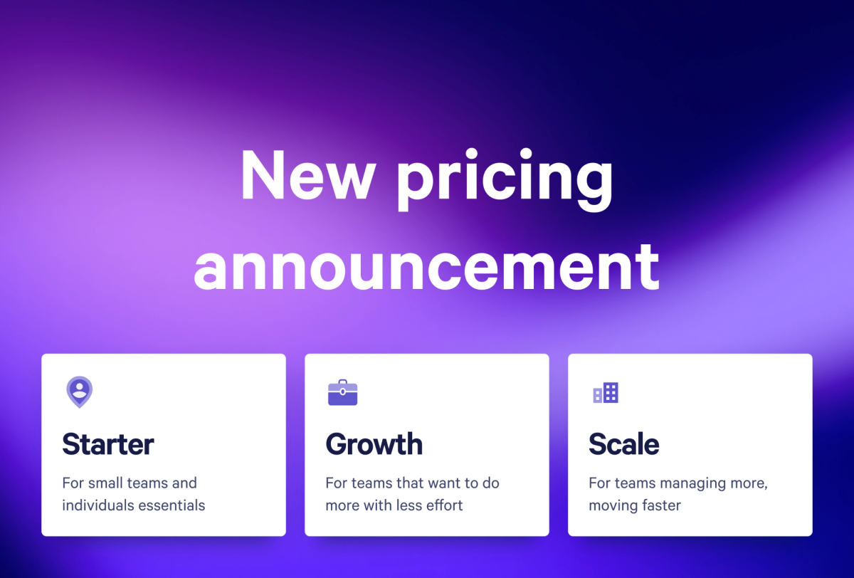
NEW: Qwilr now comes in three plans: Starter, Growth, and Scale
Guy Hall|Jun 11, 2026
Product updates•4 mins
NEW: Introducing the Smart Proposal Engine
Guy Hall|Jun 11, 2026
Sales tech•12 mins
Interactive sales proposals vs PDFs: why modern buyers expect web-based experiences
Isabella Cerini-Palozzo|Jun 4, 2026
Sales tech•16 mins
What to Use Instead of Word for Sales Proposals
Taru Bhargava|May 12, 2026
Sales tech•13 mins
Proposal Software Integrations for End-to-End Sales
Taru Bhargava|May 12, 2026
Marketing•39 mins
17 B2B Marketing Tools to Build a Smarter Stack
Marissa Taffer|May 7, 2026
Sales techniques•26 mins
15 Sales One-Pager Examples, Templates & Tips
Kiran Shahid|Apr 22, 2026

Sales techniques•17 mins
How to Write a Video Production Proposal [+Template]
Kiran Shahid|Apr 13, 2026
Sales techniques•22 mins
How to Write a Brand Collaboration Proposal [+Template]
Kiran Shahid|Apr 9, 2026
Sales techniques•20 mins
170 Essential Sales Statistics You Need to Know in 2026
Kiran Shahid|Apr 8, 2026
Sales management•22 mins
How to Write a Sales Proposal That Shortens Your Sales Cycle
Kiran Shahid|Apr 8, 2026
Sales management•21 mins
How to Write a Real Estate Investment Proposal [+Template]
Kiran Shahid|Apr 1, 2026
Marketing•21 mins
How to Write a Recruitment Proposal & What to Include
Kiran Shahid|Apr 1, 2026
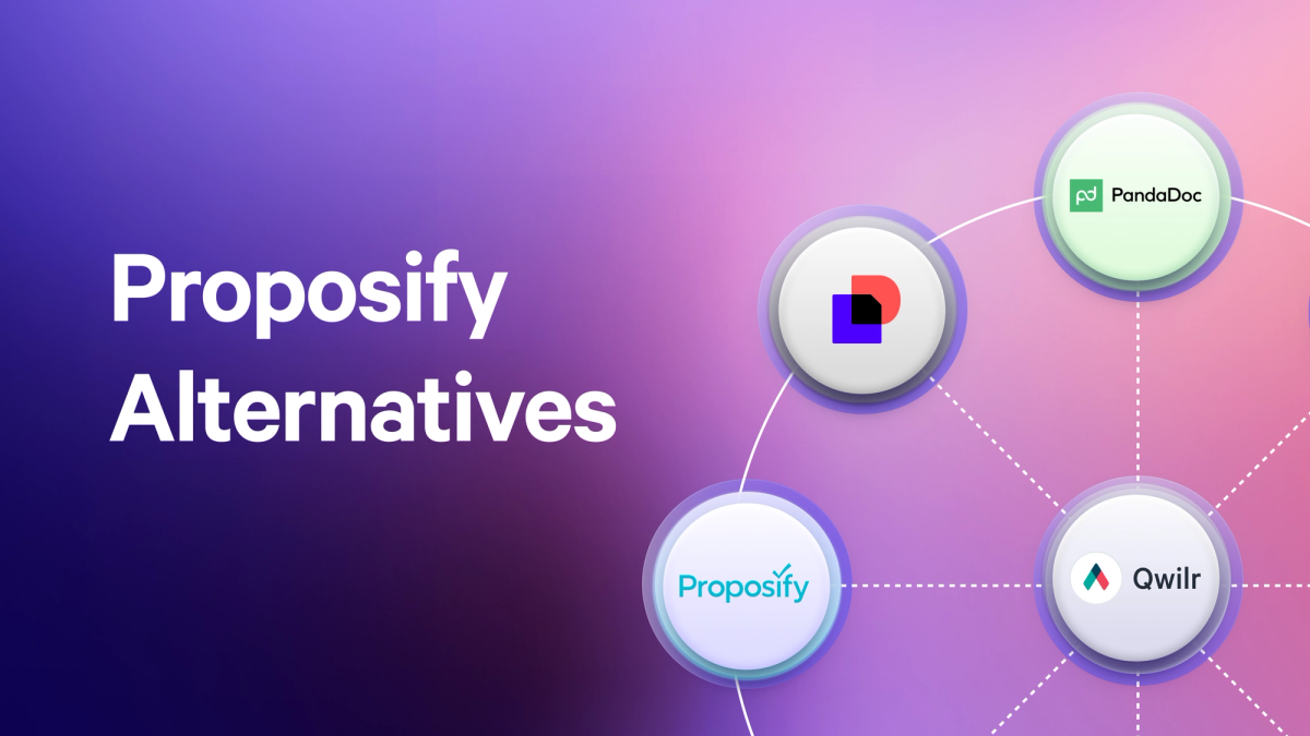
Sales tech•35 mins
8 Proposify Alternatives to Consider If You’re Making the Switch
Kiran Shahid|Mar 31, 2026
Sales techniques•18 mins
How to Write a Product Proposal That Does The Selling For You
Taru Bhargava|Mar 30, 2026
Marketing•20 mins
How to Write an App Development Proposal [+Template]
Kiran Shahid|Mar 27, 2026

Marketing•21 mins
How to Write an SEO Proposal: Template + Expert Tips
Kiran Shahid|Mar 25, 2026