The Ultimate Guide for Winning Sales Presentations in 2025

The Ultimate Guide for Winning Sales Presentations in 2025
Most sales professionals know that great sales presentations can make or break a deal. Yet, for many, they are daunting, time-consuming, and an activity they detest.
Presentations are an integral part of a sales process and the fastest way to turn a prospect into a paying customer.
Like public speaking, creating and delivering a sales presentation is essential for sales teams to master. In this all-in-one guide, we share everything you need to create, deliver, and nail sales presentations.
Key takeaways
- A sales presentation is a tool to convert prospects into paying customers. Its primary goal is to convey value, convince decision-makers, and drive prospects closer to conversion.
- Success begins with understanding your audience. Research their roles, needs, and challenges to tailor your message and build rapport.
- Effective sales presentations require meticulous preparation, including rehearsals, crafting engaging proposals, and aligning the team's efforts.
What is a sales presentation?
A sales presentation is a tool that sales teams use to move buyers into paying customers. It is usually conducted in a small group and is traditionally accompanied by a demo.
Well-researched presentations allow sellers to showcase the benefits of their products, educate buyers on why their offering is better than a competitor's, and satisfactorily answer any questions they may have—to say there’s no sale without a presentation wouldn’t be a big stretch.
Effective presentations should reflect your brand, communicate your message, be personalized to the buyer's needs, grab your prospect’s attention, and lead them to the desired conclusion — your product.
What is the goal of a sales presentation?
In a nutshell, a good sales presentation has one key goal—getting the prospective customer to move forward in the sales process and closer to a conversion. However, before a conversion, sales reps must focus on two essential ‘C’s — convey and convince.
Convey
The first step in a winning sales presentation template is to convey the value of your product to the target audience. This step requires you to talk about the benefits, the outcomes, and the results that they can expect. This requires a lot of preparation and is not something that you should dive into blindly.
Invest time in gathering valuable intel during the research and discovery phase so that you’re able to convey the information that your audience will find most valuable.
Convince
Convincing key decision-makers is difficult—ask any sales rep, and they’ll tell you the same. Some sales reps jump into a presentation with the core idea of “selling,” but successful sales reps approach this goal differently.
So what’s different in their approach? Successful sales reps tailor their presentation to be more personalized; they invest in building rapport, nurturing relationships, and demonstrating their value much before the actual sale.
Moreover, they are empathetic and reasonable when having conversations and providing solutions. That being said, the expectation from the buyers at this stage is that sales reps can provide them with data, satisfy the use case, or offer valuable and unique insights that convince them to say yes.
The above steps require a tactical approach, careful research, and the ability to tell a compelling story. If implemented correctly, they will drum up excitement and ensure that your buyers sign on the dotted line quickly.
How to prepare for an important sales presentation
Preparation is key to a successful sales presentation and an essential step in closing a sales deal.
Research your audience
Well before you are scheduled to deliver your presentation, you want to make sure you know who will be in the room (or on Zoom) with you. If you’ve been working on this deal for a while, you may have met most of the key players, but when it comes to the big presentation, you might meet some new team members, including senior leaders.
Gathering intelligence on their positions within the company, involvement in the buying process, preferences, dislikes, personalities, communication styles, and reasons for seeking what you offer will enable you to be more persuasive and help you build rapport.
You might not be able to know with 100% certainty who will attend the presentation, but doing your due diligence and knowing who the key decision-makers are is critical to the success of your presentation and potential deal.
Review your accompanying proposal
Losing your buyer after the presentation is a definite risk if your sales proposal lacks excitement. The solution? Crafting an engaging sales proposal that captivates the audience in front of you even after you’ve said your goodbyes.
As you evaluate your proposal, review it with a critical eye— is your message clear? Does your design support or detract from your message? Is the design consistent throughout your document? Are the data points fact-checked?
Don’t whip up a proposal that does not reflect your offering in the best possible light or isn’t tailored to the audience. Need some inspiration? We provide a lot of tips, pointers, and examples, plus the reasoning behind each, in our Proposal Look Book.
Rehearse
Great presenters rehearse. Period. Rehearsing before the actual presentation will help you perfect your delivery and practice overcoming any objections that come up along the way. Instead of fumbling for answers, you (or anyone else on the team) will deliver them confidently.
This doesn’t have to be stressful; even a few minutes a day can provide a ton of value—you can practice your introduction during everyday activities like driving or walking. Additionally, allocate extra practice time to rehearse complex or technical sections of the presentation, delivering those slides out loud.
The “gospel of 10x” is a popular business philosophy on rehearsing by Larry Page of Google and one your sales teams can learn from. The crux is to be prepared to rehearse far more than you’ve done in the past and ten times harder than your peers if you want to succeed.
Make it a team activity
Is your company's sales presentations a one-person show or a team effort? If it’s something a senior salesperson leads, then it’s time for you to rethink!
A survey by Harvard Business Review found that a team pitch with good chemistry together is much more trustworthy than one senior person who does all the talking. So use your team to amplify your expertise in a pitch, not dilute it. Sales presentations can be a great learning opportunity for newer or more junior team members if their role is carefully defined and properly supported.
Practice confident body language
Having confident body language helps to convey credibility, and enthusiasm, instantly capturing the attention and interest of the audience and helping you close more deals.
Make eye contact
No one wants to sit in a presentation where the salesperson is reading off a slide deck or their notes. Making eye contact plays a crucial role in building trust and establishing a connection with potential clients, so don’t miss out on it. If you need to glance at your notes or look at the slide because you lost your place after someone asked a question, that’s okay. Just remember to look up at the audience (or the camera in a virtual presentation) as much as you can!
Talk firmly but slowly
Studies suggest that effective presentations are 38% your voice! By using a firm yet soft tone, salespeople can effectively communicate their message, engage their audience, and establish a sense of trust, ultimately increasing the likelihood of a successful sales outcome.
Smile
Smiling is a powerful weapon, whether it’s a 1:1 presentation, a large group meeting, or even on the phone. When presenting, ensure that your sales team is smiling when needed, as it can instantly put your audience at ease.
How to host sales presentations
As the seller or sales leader in the presentation, you’re also charged with being a gracious host! This means ensuring everyone is well prepared and has everything they need for a great experience—follow these tips to get ready.
Read next: How to create a winning business proposal presentation
Be proactive in sharing the sales deck
In a usual setup, sales teams walk into a presentation armed with a sales deck keeping the contents a secret the whole time! But how about flipping the approach and sharing the sales deck with the prospects at least a day or two before the sales presentation? Some executives or members of your buying team might benefit from the opportunity to do a pre-read and come to the presentation ready for a robust discussion.
It shouldn’t be an expectation that everyone in the meeting will have reviewed the sales deck in detail, but if the buying team has some context, the benefits may outweigh any negatives. By now, you know that sales presentations have a lot of moving parts, and more often than not, there’s a lot of ground to cover.
As a sales team, your goal in the presentation is to highlight the most significant details of the pitch deck and show value. When you share the contents beforehand, you are giving ample time for your prospects to review the pieces that are most important to them and come prepared for the session.
Encouraging them to share questions beforehand can also help you identify what caught their attention, and you can focus on that area at length during the presentation!
Pro tip: Create a short and long version of your slide deck. Send them the long version that covers the ins and outs of the entire presentation beforehand, and hand over copies of the shorter version highlighting just the key pointers during the session. This will help them stay the course without getting confused and overwhelmed. Of course, make sure that you use your persuasive sales words during the presentation to make an impact!

With Qwilr you get detailed analytics on how your prospects engage with your sales presentation, providing valuable insights before the meeting
Focus on value
Acquiring a new customer is hard and at least five to 25 times more expensive than retaining them. This is why most sales teams want to keep a customer for a lifetime. In fact, research by Frederick Reichheld of Bain & Company (the inventor of the net promoter score) shows that increasing customer retention rates by 5% increases profits by 25% to 95%.
Long-lasting customers prioritize the value of a product more than just the product features. Can your customers see revenue benefits, or will using your product show prestige or provide them with a competitive edge? These are things that matter more to them from a business point of view. For this reason, high-growth sales organizations today follow a value-based selling approach (almost 87% of them, according to research).
For example, Todoist— a task manager and to-do list app, sells itself as a tool that helps customers organize their work and life and harps on mental clarity and simplicity as its value proposition. Similarly, Intercom—a customer service and sales tool, sells saving time and money as its value proposition.
This illustrates why it’s important that you’re showcasing how awesome your product or service is in a way that's super easy to understand and totally undeniable.
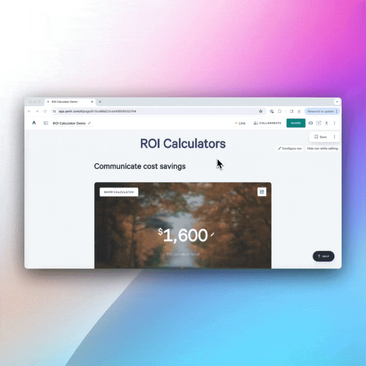
Use Qwilr’s ROI calculator to show prospective customers exactly how they can expect to benefit from working with you.
Be a master of data
It’s always nice to showcase how brilliant your product is, but without data, it lacks merit. That’s why having a sales team that knows their stuff and can back it up with data driven presentations is a game-changer.
“Knowing how to develop and deliver a data-driven presentation is now a crucial skill for many professionals since we often have to tell our colleagues stories that are much more compelling when numbers back them”
Researcher and Consultant Alexandra Samuel
Let's imagine you're vying for a major contract to provide customer relationship management software. The potential client wants to be confident that they're partnering with a team of experts, so whip out impressive case studies, metrics, pricing comparison graphs, and success stories to make them think, "These folks really know their stuff when it comes to analyzing data and driving results!"
But again, when presenting it to a wider audience, ensure that you can marry good storytelling with data, i.e., present complex data in a clear and comprehensible manner.
Ensure you’re adding enough data visualizations, such as graphs and charts, to help them perceive and interpret trends and patterns within the data that may otherwise be difficult to understand.
When showcasing data:
- Get it on the big screen! Ensure it's visible and easy to read for everyone in the room.
- Don't get lost in the weeds. Focus on the main points your data is illustrating and make them shine.
- Each chart should have one major point to convey. Keep it clear and straightforward for maximum impact.
- Labels are your friends. Ensure your chart or graph’s components are clearly labeled for easy understanding.
- Highlight those "Aha!" moments. Use visual cues to draw attention to the most significant insights in your data.
- Choose a title for your slide that reinforces the key point from your data and grabs attention.
Mistakes to avoid in your sales presentations
Assuming the deal is already closed
Confidence is essential in sales, but acting like the deal is already in the bag before the ink is dry? That’s a rookie mistake. Many prospects want to be pursued through the entire process and dropping the ball too early can be a deal breaker.
Instead of prematurely celebrating, focus on demonstrating your value and addressing concerns until the dotted line is signed. Remember, you’re not in the winner’s circle until they say “yes.” So, keep the champagne corked for now—and make sure you end your presentation well.
Presenting too much information
A glassy-eyed audience is a presentation killer. Engage your prospects with a punchy, to-the-point presentation and avoid overloading them with a ton of information. Get rid of the fluff and zero in on what’s really important—their pain points and your solution.
Where relevant convey concepts using graphics and data to keep it concise and easy to digest. Avoid repeating points and including information that doesn’t directly relate to the core topic.
Focusing too much on your product
Here’s the truth: your prospects don’t care about your product; they care about how it can solve their problems. Spend too much time rattling off features, and you’ll see their eyes glaze over faster than a donut. Instead, zero in on benefits—what’s in it for them? Show how your product fits into their world, eases their headaches, and makes them the office hero. The spotlight is on them, not your shiny product specs.
Winging it
We’re not saying you’re not an excellent salesperson, but even for the most experienced in the industry winging a sales presentation is a recipe for disaster.
Think of it like showing up to a wedding without rehearsing your speech—it might be memorable, but not in the way you want. Preparation is your secret weapon. Research, rehearse, and be ready to handle curveballs. A polished presentation shows professionalism and respect for your prospect’s time. Besides, why risk a closed-lost deal when a little prep could have you gliding through like a pro?
Poor objection handling
When objections pop up, don’t panic—they’re not deal-breakers, they’re opportunities. The worst thing you can do is stumble through a response or dismiss concerns entirely.
Instead, embrace objections. Listen carefully, validate their perspective, and offer clear, data-backed solutions. Addressing objections with confidence not only builds trust but also shows you’re the real deal. Bonus points if you can sprinkle in a bit of charm—it never hurts to lighten the mood.