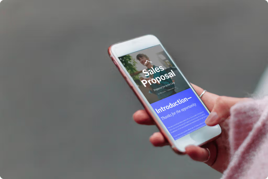
Crafting a winning sales proposal is part art, part science. The storytelling element needed to capture a prospect’s attention and show them how, with your product or service, they will have a happy ending (or more time or money) is an art in itself.
It can be a science because you also need the right data to support your story. Pulling in the right case studies, data points, and industry research to back up your storytelling ability and add the right amount of proof is critical to proposal writing.
It’s a delicate balance — and not easily achievable. So we chatted with our Sales Reps at Qwilr and unpacked their secrets when it comes to creating exceptional sales proposals that get the buying committee from “maybe” to “where do I sign?”
Before we dive into the full list, hear directly from one of Qwilr’s talented Account Executives where they share five elements every proposal must contain to improve your odds of winning the deal:
View the full presentation deck
What is a sales proposal?
A sales proposal is a document that outlines your solution to a potential client's needs or problems. Sales reps and teams normally use this document in the sales process to persuade the client to purchase their product or service.
Your sales proposal should be personalized, persuasive, and organized in a clear and concise manner. It should showcase your understanding of the client's needs and how your product or service can help solve their problems.
It should also include details on pricing, timeline, and other relevant information that will help convince the client to choose your solution. Overall, a well-written sales proposal is essential for winning new business and increasing revenue for your company.
Clearly, a sales proposal is crucial for closing deals. Beyond its sales value, however, you should also think of it as a tool that helps you improve your buyer experience and strengthen your relationship with the client.
By crafting a personalized and compelling proposal, you are not only showcasing your product or service but also demonstrating that you understand the unique needs and goals of your potential client.
Your sales proposal is more important than ever
It may feel like preparing for your sales presentation is the most critical step in the sales process. And yes, its true that getting a prospect to give you time for a meeting is a big deal. But, during your presentation your prospect might be:
- Distracted by a budget.
- Replying to emails, Slack, or Teams messages.
- Looking at the clock, ready to “check out” (and then into their sixth meet for the day.)
And to make things even more complicated, they frequently leave two-thirds of the buying committee off the invite.
The good news? Virtual selling isn’t deterring buyers from making large purchases through digital channels. So, even if you may feel distanced from your potential customers, it doesn’t mean you can’t close the deal.
You can. A clear, compelling sales proposal will get you there by working for you – in every timezone, at any time of the day, every day of the week, for all buying committee stakeholders (even those who aren’t in the meeting).
Key takeaways:
- The process of creating a strong sales proposal involves a careful combination of understanding your potential client's needs and presenting your solution in an appealing way that encourages them to sign the deal.
- Despite the challenges of virtual selling, it is not a deterrent for B2B buyers looking to make significant purchases.
- The personalization of the buyer's experience is crucial in the sales proposal process. The level of customization in your sales materials can significantly impact your buyer's decision-making process.
- Incorporating visual elements into your sales proposal can be beneficial, as humans process visual information faster than text. Including relevant graphics and images can enhance the overall appeal of your proposal.
How to build winning sales proposals
If you want your sales proposal to represent you well, even when you’re not in the room, you must ensure it’s perfect.
This means:
- A clearly defined scope of work
- Outlined deliverables
- Revenue-based outcomes
- No typos and spotless grammar
- Personalized and on-brand
Most importantly, all the elements of your sales proposal must come together and create a story that shows you clearly understand your customer’s needs and how you will address them.
Not sure where to get started in enhancing your sales proposal experience?
Dive into the 10 Key Elements of Winning Sales Proposals below.
1. Personalize the buyer experience
Personalization is one of the critical ingredients in convincing prospects you’re worth their time and money. And here’s why: everybody wants to feel ‘heard.’ Your buyer is no exception.
Two out of three buyers are influenced by the quality and customization of your sales materials, and a quarter of them will only accept personalized materials. (SaaS Buyer Experience Study, 2021)
In our webinar poll, 80% of participants said they are personalizing their sales proposals, although 76% said it’s a manual process— typically searching and replacing or manually typing in data.
The obvious disadvantages of manually personalizing proposals include:
- It’s time-consuming, eating into valuable selling time
- It’s prone to human error
- It’s not scalable
Alternatives to manual personalization include using a proposal solution like Qwilr that can plug directly into CRMs like HubSpot and Salesforce, so you can create tailored proposals with just a few clicks, pulling key customer data from your CRM.
However, even if you don’t use a proposal solution and decide to go the manual route, you should do a few things so that your prospect connects with your proposal.
First, at the very minimum, your collateral should include your potential customer’s name, company name, logo, and an image relevant to them.
Next, and this is especially important for high ticket and complex sales, you want to tailor your proposal to fit the types of narratives your buyer’s likely to engage with. Then, you want to ensure you include hand-picked data relevant to your prospect
2. Make it visually appealing
The human brain can process visual information 60,000 times faster than the written word. Additionally, we remember only 10% of written information after three days but retain 65% of the message when presented with relevant images.
Adding relevant, supporting graphics and using charts or graphs to illustrate key data points can make your sales proposal easier to digest — and more memorable. So, while your prospects may be evaluating other business proposals, using the right visuals will help yours stand out for being engaging, comprehensive, and compelling.
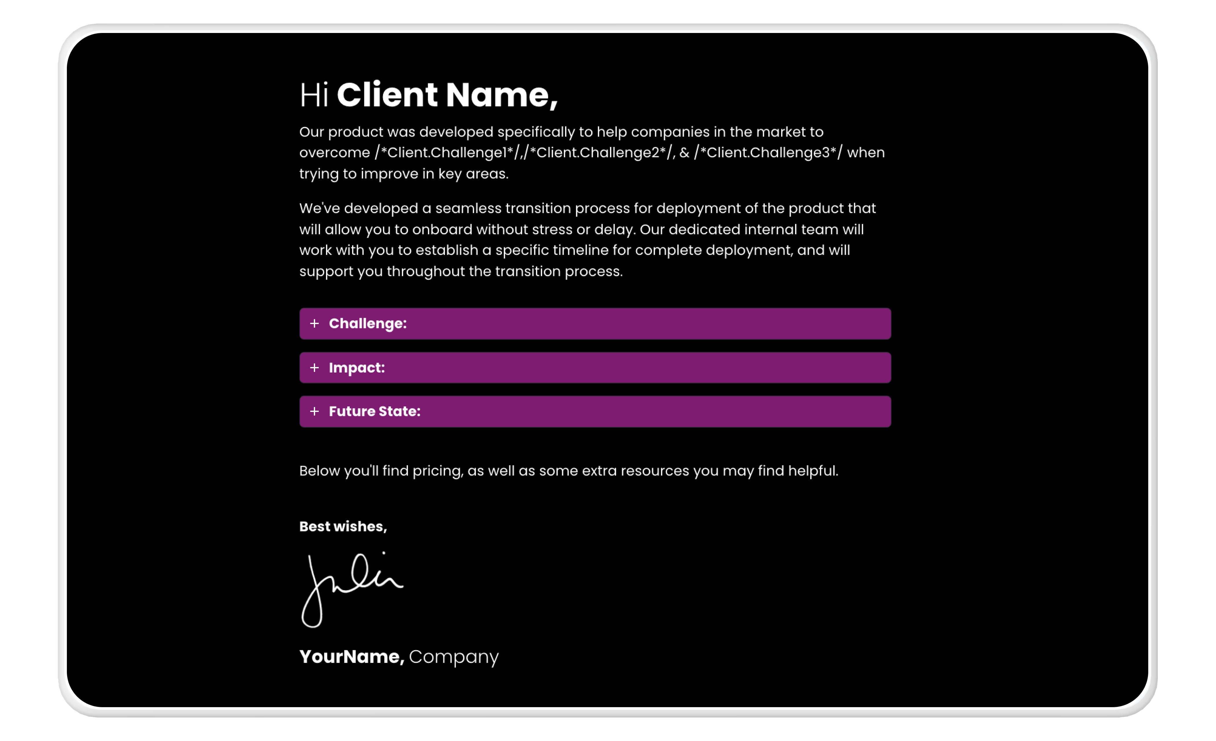
3. Underline the problem statement
Research shows that 70% of buyers make a purchase to solve a problem, so it’s beneficial to understand that dilemma. Uncovering the buyer’s problem is usually part of the discovery call. However, if you uncover gaps in your understanding of the buyer’s situation, it’s perfectly acceptable to go back and ask the buyer for clarification.
A problem statement reflects your potential client’s challenges and may include anything from workflow bottlenecks to resource challenges or other fundamental difficulties.
Including a problem statement in your sales proposal serves many purposes, including that it:
- Demonstrates to the buyer that you’re listening. Only 13% of buyers believe salespeople understand their needs; a problem statement shows them otherwise.
- Opens a dialogue between you and your buyer as you discuss the challenges and desired future state.
- Highlights gaps in your knowledge and if further exploration is needed on your part.
Sometimes, buyers aren’t always clear on the underlying problem but are familiar with the resulting symptoms. Questions to help uncover the buyer’s root problem include:
- What’s your biggest inhibitor to growth?
- What is your most significant pain point?
- What does your boss obsess about?
- What consumes the most time in your day?
- What topic always surfaces in your internal meetings?
And, of course, never underestimate the personal side of a buyer’s challenges. Asking what would help improve their lives can uncover problems like work/life balance or professional aspirations that make for solid motivators to move forward with a purchase.
4. Bring forward a compelling offer
Your offer and pricing play a critical role in the sales process and any subsequent negotiation. Deals are often won or lost based on price alone, even though salespeople are trained to show the offer's value and overcome pricing-related objections.
This came through in our recent survey, where we found that 58% of sales objections are related to price, although back-and-forth negotiations can also slow down the time to close a sale.
Additionally, buyers want to be empowered to choose the features and optional services that benefit them. A static Excel table or spreadsheet that lays out pricing options often does not meet buyers' preferences and may not present your price clearly.
So, don’t be afraid to add a little flair to your pricing presentation. Alternatives to the standard Excel table include interactive and tiered pricing tables, which can be especially helpful for price-sensitive buyers.
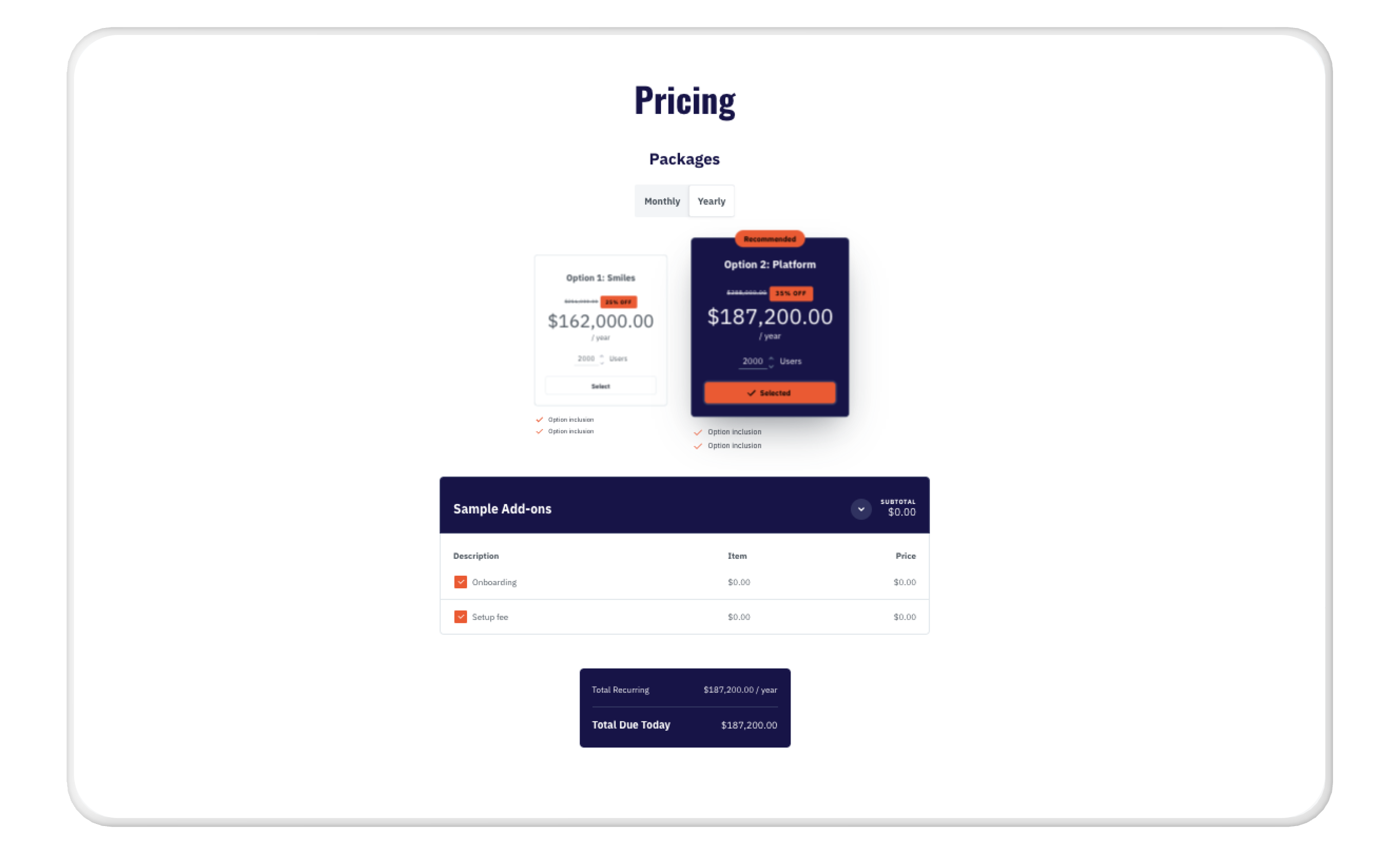
Quote Block of Qwilr's Enterprise Proposal
Want to delve deeper into crafting irresistible offers? We wrote the Pricing Playbook on that – check it out!
5. Include a call to action (or two)
After all the phone calls, email messages, and finally presenting your sales proposal, you’ve told your buyer what, why, and how much. Now, tell them what to do about it! E-signatures are convenient, popular, and legally compliant, too.
Many businesses will split their sales proposal from the agreement, meaning you must send a separate document for your prospective client to approve. However, Qwilr offers features that make it seamless for your prospect to accept, sign, and even pick from several payment options — without ever navigating away from your proposal.
This is a classic case of making it easy for stakeholders to say “yes,” thus streamlining the end of your sales process and reducing any friction.
If your buyer isn’t ready to accept and sign your proposal (yet)? That might feel discouraging, but it happens, and not all hope is lost. You could, for example, include a secondary call to action in your proposal. This might look like an embedded calendar link so they can book a time to follow up and continue the conversation to get to a point where they’re ready to sign.
A quick tip when including call to actions in your email communication, is to use a professional email signature software to level up your email game. A well-crafted email signature can help reinforce your message and professionalism while also giving you the possibility to include calls to action, such as inviting prospects to view your proposal or to get in contact if wanted.
6. Spend extra time on your executive summary
Writing a compelling and engaging executive summary can single-handedly win half of the battle. Your prospects are busy; they have a number of priorities competing for their time and attention, not to mention the proposals from your competition to review. They want to know what’s in it for them: how your solution will help their business thrive.
Your executive summary should include all the essential information in your sales proposal — sprinkling in ‘know-how’ so your prospect knows you’ve been listening.
Make sure your summary includes the following:
- A quick overview of the proposal
- Your customer’s needs and challenges
- Your proposed solution to said needs and challenges (how your business will help theirs)
- Your competitive advantage (why should they choose you over anyone else?)
- A clear, concise, and inviting call to action so you’re able to close the deal easily
Executive Summary of Qwilr's Gap Selling Template
7. Include social proof
One of the main reasons people buy anything is because they admire or respect others who have bought it. Social proof shows you’re trustworthy because, after all, why would anyone else sing your praises if you haven’t delivered on your promises?
Here are some types of social proof you can include in a business proposal:
- Reviews on other websites (like G2 if you sell software or Clutch if you sell services)
- Testimonials from previous clients
- Links to extensive case studies on how you solved your prospect’s problem in a different context
- Screenshots from social media posts on LinkedIn or Twitter or reviews from happy customers
If you can show potential new clients that your existing customers are ‘true fans,’ they’ll be more likely to buy from you.
8. Make your proposal structure accessible
Your prospective customers don’t have time to read endless blocks of text. Make it easy for them to understand your sales pitch by structuring the information in a way that makes it easy to read — and even easier to understand.
Some best practices for creating an accessible proposal structure include:
- Using headings and subheadings
- Including a table of contents to make the proposal easy to navigate
- Using bullet points and numbered lists (see what we did here?)
- Adding visual aids like bold and italics (without overdoing them)
- Keeping your sentences short (no more than 20 words)
- Shortening your paragraphs (no more than 4-5 sentences)
People rarely read everything, much less so when there’s no actual benefit in it for them. So make your proposal easy to skim through (without losing all the vital information.)
One easy way to structure your proposal comprehensively is to use a ready-made, sales methodology-driven template, such as:
- The BANT sales template
- The SPIN sales template
- The Gap Selling sales template
- The Marketing proposal template
Or, if you prefer creating your own narrative, you can start with a simple sales or enterprise proposal template and build from there.
9. Proofread, then proofread again
Proper grammar and punctuation are essential non-negotiables for successful business proposals. Poor grammar can be more than just a minor blunder for a target audience consisting of key decision-makers; it may become a deciding factor or a reason why they might pass on working with you and your company.
Embarrassing typos may not directly say anything about your skills as a sales professional. But they can take your prospect’s attention away from all the good things you’re doing — and place it on wrongful (albeit subconscious) associations people make about lousy grammar:
- Sloppiness
- Lack of credibility
- Lack of attention to detail
- Unprofessionalism
You don’t want these associations, so double-check your sales proposal before hitting “send.” If it helps, use a grammar checker like Grammarly or get it peer-checked by another rep or sales leader.
10. Make it all about them (the prospect)
When writing a sales proposal, you may feel tempted to share all of the features and benefits of your product or solution. It’s easy to see why: after all, you do want to close the deal, right?
Right.
The thing with humans, however, is that we’re bad at focusing on anything less relevant to us. As such, rambling on about the various features of a product or service may not be the best way to go if you want to craft a winning sales proposal.
Instead, make it all about your prospect and position the solution as the answer to their business pain or challenge.
How sales proposal templates make your processes more efficient
Starting from scratch with every client can be exhausting and overly time-consuming for a salesperson.
You can't skip some parts of creating your proposal -- like proper customer research, deep-diving into your prospect’s pain points and mindset, and elaborating on solutions that fix their problems.
You can, however, simplify your sales proposal building processes -- and that is precisely where a customizable sales proposal template can help you.
A professionally designed proposal template can save time, energy, and stress. It can:
- Streamline the design process so you can spend more time on what you do best - engaging with prospects and customers
- Ensure branding and visual consistency across all your sales assets (even if you’re not a design wiz)
- Help build trust between you and your potential client by demonstrating that attention to detail is important to you and your company
- Provide a ready-made, professional-looking structure for all the essential information every prospect needs before making a buying decision
- Provide your customer with a professionally designed, web-based proposal that can be easily shared with stakeholders, signed, and accepted without printing and scanning
- Allow you to track and follow up on customer engagement with your sales asset so you know when to reach out proactively
- Provide a central repository of pre-designed content blocks (like About Us pages or Case Studies) to help you quickly build a comprehensive proposal.
You can even get started with building your own template quickly by using Qwilr's AI proposal generator.
The best proposal templates make your sales process more effective and efficient.
Sales proposal example
Let's take Qwilr's Enterprise Sales Proposal Template to showcase how a strong template can help make proposal writing more effective. This template aims to help enterprise teams close out high-value deals, so each section is carefully crafted to help achieve this goal.
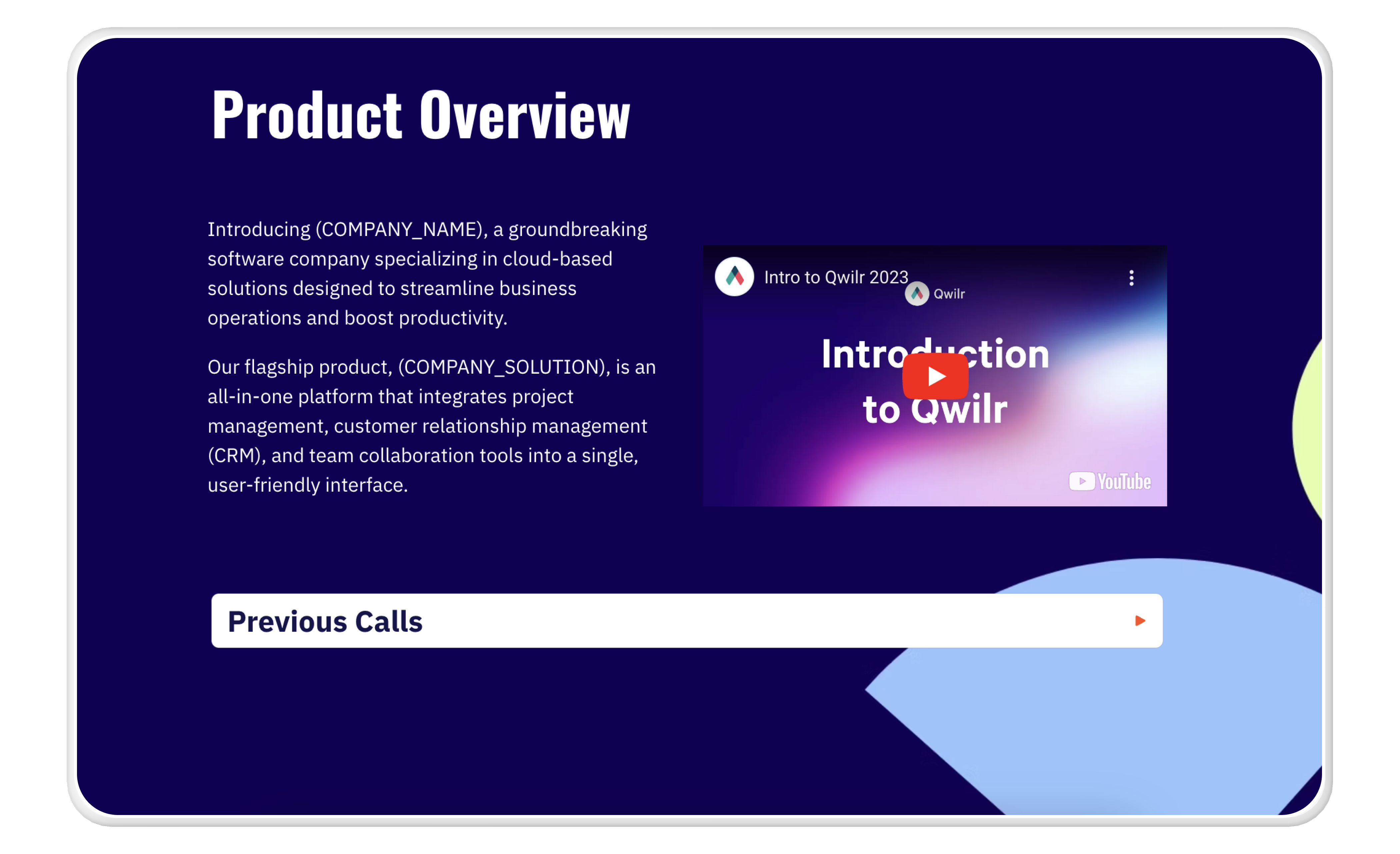
Project Overview of Qwilr's Enterprise Proposal
One of the reasons why Qwilr's Enterprise Sales Proposal works so well is that it combines visual and text-based elements. This helps your potential client easily skim through the information and still fully comprehend your offer – this is especially helpful when you're dealing with a buying committee that includes both economic and technical buyers.
Here are a few elements included in the software sale proposal template:
- Product executive summary
- Customer service overview
- Customer case studies
- Security and privacy compliance
- Terms and conditions
- Ability to accept and sign the terms
- About the company
- Contact us information
Bonus tip: leverage buying committee quotes to level up your proposal game
Truth be told, a lot of sales proposals and assets are not sufficiently personalized. At most, they only contain the company name and a few minor details unique to the prospect.
Capturing quotes from the buying committee can help demonstrate your understanding of their needs, goals, and challenges and show you actively listened throughout the sales cycle.
This helps you build relationships with multiple stakeholders in a company (a technique called "multi-threading sales")
You might not always be able to do this -- but whenever possible, incorporate the words and ideas you heard from stakeholders and gather quotes from multiple members of your buying committees. They can make a real difference in your sales proposal success.
Final thoughts
Your sales proposal reflects your brand and needs to “speak” on your behalf after the Zoom call ends. Make it easy for buyers to say “yes” by communicating your offer clearly and providing the next steps. A good proposal shares information about your product or service. A great sales proposal is memorable, rises above the competition, grabs attention, and accelerates the path to winning the deal.
Book a demo with our team to learn how Qwilr’s web-based sales proposal software can help you impress buyers, improve your win rates, and scale your sales team.
About the author

Brendan Connaughton|Head of Growth Marketing
Brendan heads up growth marketing and demand generation at Qwilr, overseeing performance marketing, SEO, and lifecycle initiatives. Brendan has been instrumental in developing go-to-market functions for a number of high-growth startups and challenger brands.
FAQs
A sales proposal is a document that outlines your solution to a potential client's needs or problems. It is used in the sales process to persuade the client to purchase your product or service. It should be personalized, persuasive, and organized in a clear and concise manner.
Key elements of a winning sales proposal include personalizing the buyer experience, making it visually appealing, underlining the problem statement, bringing forward a compelling offer, including a call to action, spending extra time on your executive summary, including social proof, making your proposal structure accessible, proofreading, and making it all about the prospect.
You can make your sales proposal visually appealing by adding relevant, supporting graphics and using charts or graphs to illustrate key data points. This can make your sales proposal easier to digest and more memorable.
The top five key elements of a written sales proposal are an executive summary, enough detail to paint a comprehensive picture of the problems and solutions at hand, a good reason your prospect needs to buy your service now, a quick outline of the next steps, and an easy to read, persuasive design.